flowchart LR
    %% Main linear flow
    Acquire --> Tidy
    Tidy --> Transform

    %% Circular connections between Transform, Visualize, and Model
    Transform <--> Visualize
    Visualize <--> Model
    Model <--> Transform

    %% Final connections to Communicate
    %% Visualize --> Communicate
    Model --> Communicate

    %% Styling for clean appearance
    classDef default fill:#ffffff,stroke:#000000,stroke-width:2px,color:#000000,font-family:Arial,font-size:14px

    class Acquire,Tidy,Transform,Visualize,Model,Communicate default
Data Science Pipeline
MScAS 2025 - DSAS Lecture 5
2025-10-21
EDA Steps
Overview
1,338 clients × 7 variables | No missing values | Ready to analyze!
Key findings
Age 18-64 | BMI mean=30.7 (overweight) | Charges: very significant range $1K-$64K!
Show code
# Load data for visualization
data = pd.read_csv('healthinsurance.csv')

# Create scatter matrix with custom layout
variables = ['age', 'bmi', 'children', 'charges']
n_vars = len(variables)

fig, axes = plt.subplots(n_vars, n_vars, figsize=(11, 8))

for i in range(n_vars):
    for j in range(n_vars):
        ax = axes[i, j]

        if i == j:  # Diagonal: univariate distributions
            ax.hist(data[variables[i]], bins=20, alpha=0.7, color='steelblue', edgecolor='black')
            ax.set_ylabel('Frequency', fontsize=9, fontweight='bold')
        elif i > j:  # Lower triangle: bivariate scatter plots
            ax.scatter(data[variables[j]], data[variables[i]], alpha=0.4, s=10, color='navy')
            ax.set_xlabel(variables[j] if i == n_vars-1 else '', fontsize=9)
            ax.set_ylabel(variables[i] if j == 0 else '', fontsize=9)
        else:  # Upper triangle: hide
            ax.axis('off')

# Add labels to leftmost column and bottom row
for i in range(n_vars):
    axes[i, 0].set_ylabel(variables[i], fontsize=10, fontweight='bold')
    axes[n_vars-1, i].set_xlabel(variables[i], fontsize=10, fontweight='bold')

plt.suptitle("Scatter Matrix: Looking for Relationships\n(Diagonal = Univariate | Lower Triangle = Bivariate)",
             fontsize=13, fontweight='bold', y=0.995)
plt.tight_layout()
plt.show()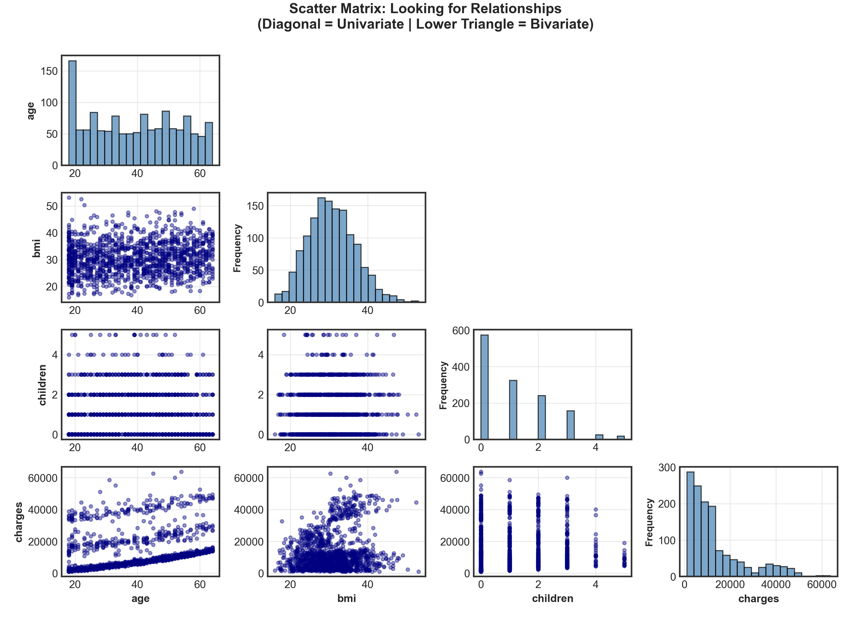
Warning
Suspicious pattern spotted! Age vs. Charges shows 3 distinct groups → not random scatter!
Diving Deeper: Risk Factors
Show code
fig, axes = plt.subplots(1, 2, figsize=(10, 4.5))

# Histogram of age
_ = axes[0].hist(data['age'], bins=47, edgecolor='black', alpha=0.75, color='steelblue')
_ = axes[0].set_title("Age Distribution", fontsize=12, fontweight='bold')
_ = axes[0].set_xlabel("Age (years)", fontsize=10)
_ = axes[0].set_ylabel("Frequency", fontsize=10)
_ = axes[0].grid(True, alpha=0.3, axis='y')

# Scatter plot: Age vs Charges
_ = axes[1].scatter(data['age'], data['charges'], alpha=0.5, s=30, color='coral', edgecolors='black', linewidth=0.3)
_ = axes[1].set_title("Age vs. Annual Charges", fontsize=12, fontweight='bold')
_ = axes[1].set_xlabel("Age (years)", fontsize=10)
_ = axes[1].set_ylabel("Charges ($)", fontsize=10)
_ = axes[1].grid(True, alpha=0.3)

plt.tight_layout()
plt.show()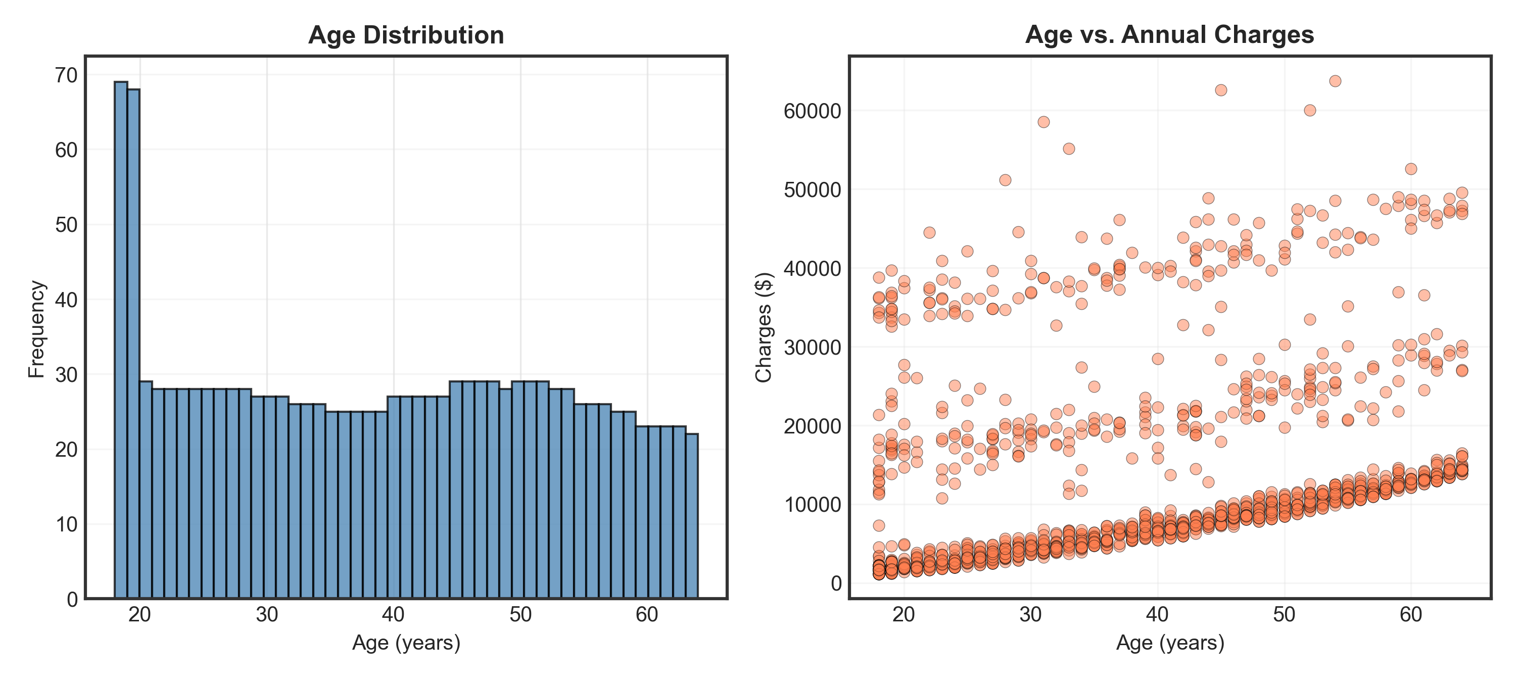
Observations
- Age: Nearly uniform distribution (except spike at 18-19 years)
- Charges: Clear 3-tier structure → low, medium, and high-cost groups! What explains this?
Show code
# Calculate percentages
smoker_counts = data.groupby('smoker').size()
total = len(data)
pct_smoker = (smoker_counts['yes'] / total) * 100
pct_nonsmoker = (smoker_counts['no'] / total) * 100

# Create scatter plot
fig, ax = plt.subplots(figsize=(10, 4.5))

colors = {'yes': 'orange', 'no': 'purple'}
for smoker_status in ['yes', 'no']:
    mask = data['smoker'] == smoker_status
    label = f"Smoker ({pct_smoker:.1f}%)" if smoker_status == 'yes' else f"Non-smoker ({pct_nonsmoker:.1f}%)"
    _ = ax.scatter(data.loc[mask, 'age'],
                   data.loc[mask, 'charges'],
                   c=colors[smoker_status],
                   label=label,
                   alpha=0.6, s=35, edgecolors='black', linewidth=0.3)

_ = ax.set_title("Age vs. Charges (by Smoking Status)", fontsize=13, fontweight='bold')
_ = ax.set_xlabel("Age (years)", fontsize=11)
_ = ax.set_ylabel("Charges ($)", fontsize=11)
_ = ax.legend(fontsize=10, loc='upper left')
_ = ax.grid(True, alpha=0.3)

plt.tight_layout()
plt.show()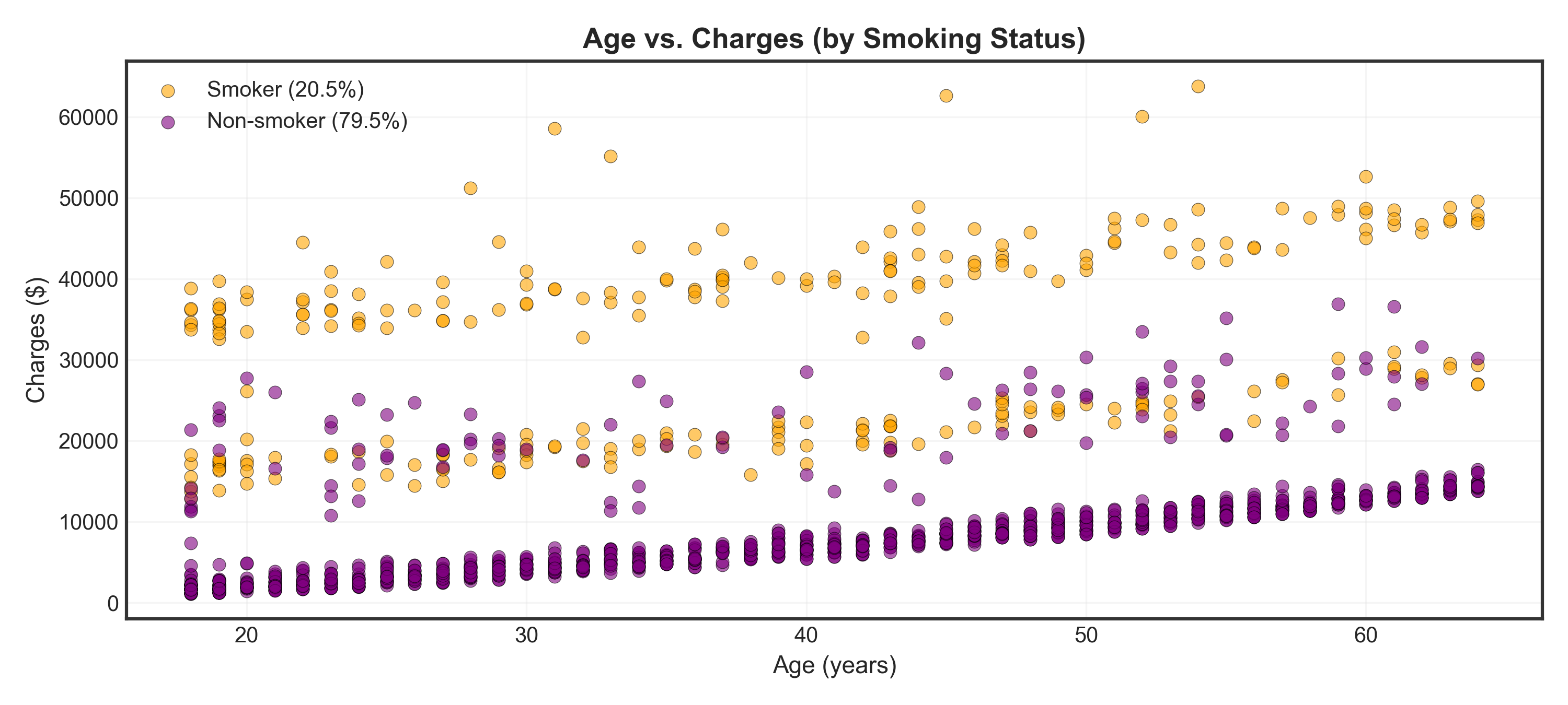
Warning
Major finding: Smokers (orange) have dramatically higher charges than non-smokers (purple) across all ages!
Show code
# --- Setup Labels ---
# 1. Define short labels for the data column and dictionary keys
short_labels = ['Underweight', 'Healthy', 'Overweight', 'Obesity', 'Severe Obesity']

# 2. Define the long, descriptive labels you want in the legend
long_labels = ['Underweight: BMI < 18.5',
               'Healthy: 18.5 ≤ BMI < 25',
               'Overweight: 25 ≤ BMI < 30',
               'Obesity: 30 ≤ BMI < 40',
               'Severe Obesity: BMI ≥ 40']

# 3. Create a "map" to link them
label_map = dict(zip(short_labels, long_labels))

# 4. Define your colors using the SHORT labels
colors_bmi = {'Underweight': 'lightblue',
              'Healthy': 'green',
              'Overweight': 'yellow',
              'Obesity': 'orange',
              'Severe Obesity': 'red'}

# --- Create BMI categories ---
# Use the SHORT labels to create the data column
data['NHS_BMI'] = pd.cut(data['bmi'],
                         bins=[0, 18.5, 25, 30, 40, 100],
                         labels=short_labels)

# --- Visualization ---
fig, ax = plt.subplots(figsize=(10, 4.5))

# Loop through the SHORT labels in REVERSE order (highest to lowest BMI)
for bmi_cat in reversed(short_labels):
    mask = data['NHS_BMI'] == bmi_cat

    # Skip if this category has no data (prevents errors)
    if not mask.any():
        continue

    _ = ax.scatter(data.loc[mask, 'age'],
                   data.loc[mask, 'charges'],
                   c=colors_bmi[bmi_cat],       # Uses the short label (e.g., 'Overweight')
                   label=label_map[bmi_cat],  # Uses the map to get the long label (e.g., 'Overweight: 25 ≤ BMI < 30')
                   alpha=0.6, s=30, edgecolors='black', linewidth=0.3)

_ = ax.set_title("Age vs. Charges (by BMI Category)", fontsize=13, fontweight='bold')
_ = ax.set_xlabel("Age (years)", fontsize=11)
_ = ax.set_ylabel("Charges ($)", fontsize=11)
_ = ax.legend(fontsize=9, loc='upper left')
_ = ax.grid(True, alpha=0.3)

plt.tight_layout()
plt.show()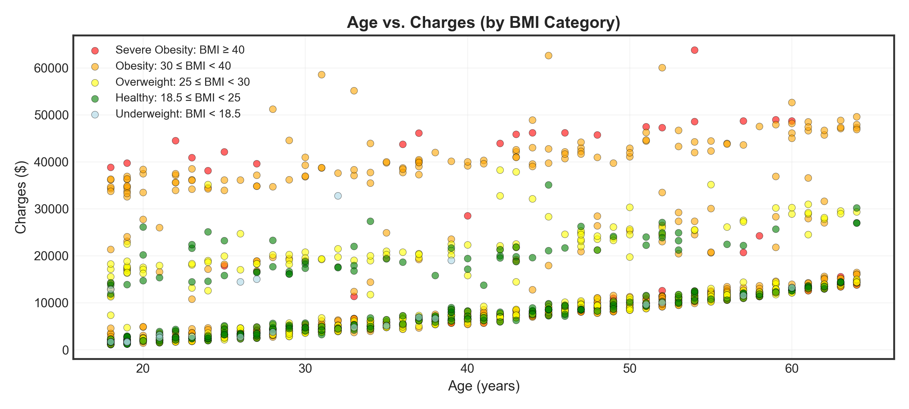
Tip
Insight: Higher BMI categories (especially severe obesity) cluster in the high-charge regions
Show code
# Create combined category
data['BMI_Smoker'] = 'BMI < 40, Non-smoker'
data.loc[(data['bmi'] >= 40) & (data['smoker'] == 'no'), 'BMI_Smoker'] = 'BMI ≥ 40, Non-smoker'
data.loc[(data['bmi'] < 40) & (data['smoker'] == 'yes'), 'BMI_Smoker'] = 'BMI < 40, Smoker'
data.loc[(data['bmi'] >= 40) & (data['smoker'] == 'yes'), 'BMI_Smoker'] = 'BMI ≥ 40, Smoker'

# Visualization
fig, ax = plt.subplots(figsize=(10, 4.5))

# Define colors and order from highest to lowest risk
colors_combined = {
    'BMI ≥ 40, Smoker': 'red',
    'BMI < 40, Smoker': 'orange',
    'BMI ≥ 40, Non-smoker': 'purple',
    'BMI < 40, Non-smoker': 'blue'
}

for category in colors_combined.keys():
    mask = data['BMI_Smoker'] == category
    _ = ax.scatter(data.loc[mask, 'age'],
              data.loc[mask, 'charges'],
              c=colors_combined[category],
              label=category,
              alpha=0.7, s=40, edgecolors='black', linewidth=0.4)

_ = ax.set_title("Age vs. Charges (Combined Risk Factors)", fontsize=13, fontweight='bold')
_ = ax.set_xlabel("Age (years)", fontsize=11)
_ = ax.set_ylabel("Charges ($)", fontsize=11)
_ = ax.legend(fontsize=9, loc='upper left', framealpha=0.9)
_ = ax.grid(True, alpha=0.3)

plt.tight_layout()
plt.show()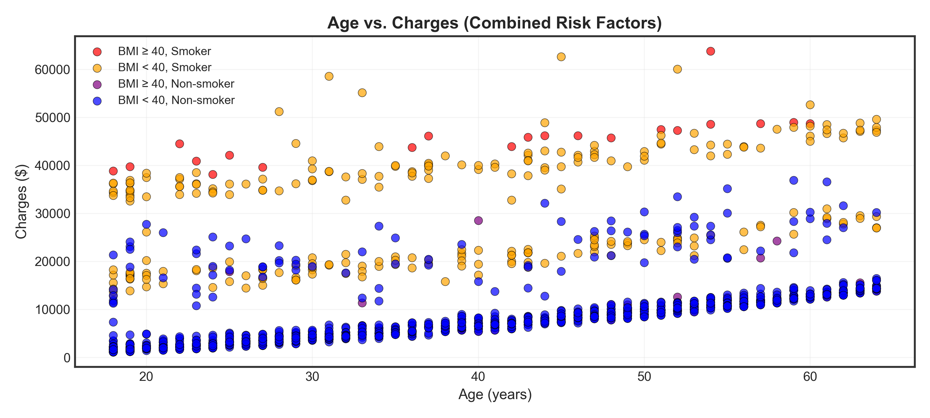
Warning
Critical finding: High BMI (≥40) + Smoking (red points) = highest charges regardless of age!
Case Study II: Interest Rate Analysis
Swiss National Bank Yield Data
Scenario: Analyzing Swiss government bond yields for risk management.
Dataset shape: 329 observations × 14 variables
| date | 1M | 2M | 3M | 6M | 1J | 2J | 3J | 4J | 5J | 6J | 7J | 8J | 9J |
|---|---|---|---|---|---|---|---|---|---|---|---|---|---|
| 1997-12 | 1.658 | 1.883 | 2.136 | 2.384 | 2.614 | 2.821 | 3.006 | 3.171 | 3.316 | 3.445 | 3.903 | 4.167 | 4.445 |
| 1998-01 | 1.407 | 1.583 | 1.809 | 2.039 | 2.256 | 2.455 | 2.636 | 2.801 | 2.949 | 3.084 | 3.593 | 3.917 | 4.284 |
| 1998-02 | 1.128 | 1.369 | 1.619 | 1.860 | 2.084 | 2.291 | 2.481 | 2.656 | 2.816 | 2.964 | 3.543 | 3.936 | 4.408 |
| 1998-03 | 1.568 | 1.758 | 1.946 | 2.131 | 2.313 | 2.488 | 2.657 | 2.817 | 2.968 | 3.109 | 3.680 | 4.065 | 4.510 |
| 1998-04 | 1.715 | 1.981 | 2.205 | 2.403 | 2.585 | 2.756 | 2.916 | 3.068 | 3.211 | 3.344 | 3.888 | 4.255 | 4.677 |
| 1998-05 | 1.720 | 1.921 | 2.111 | 2.291 | 2.461 | 2.622 | 2.773 | 2.916 | 3.051 | 3.179 | 3.722 | 4.137 | 4.712 |
| 1998-06 | 2.117 | 2.216 | 2.333 | 2.466 | 2.608 | 2.754 | 2.899 | 3.041 | 3.178 | 3.308 | 3.851 | 4.228 | 4.674 |
| 1998-07 | 1.982 | 2.067 | 2.198 | 2.347 | 2.499 | 2.649 | 2.794 | 2.932 | 3.064 | 3.190 | 3.722 | 4.120 | 4.641 |
Column naming
J = Jahre (years), M = Monate (months) so 1J = 1-year, 2J = 2-year and 1M = 1-month, 6M = 6-month
Show code
# Plot yield curves over time
fig, ax = plt.subplots(figsize=(10, 4))
months = [str(i) + "-01" for i in range(2011, 2026)]  # Every year, January

for month in months:
    if month in df['date'].values:
        yields = df.loc[df['date'] == month, df.columns[1:]].values.flatten()
        _ = ax.plot(maturities, yields, marker='o', linewidth=2, markersize=4, alpha=0.7, label=month)

_ = ax.set_title("Swiss Government Bond Yield Curves (End of January, 2011-2025)", fontsize=13, fontweight='bold')
_ = ax.set_xlabel("Maturity (years)", fontsize=11)
_ = ax.set_ylabel("Yield (%)", fontsize=11)
_ = ax.legend(fontsize=7, loc='center left', bbox_to_anchor=(1, 0.5))
_ = ax.grid(True, alpha=0.3)
plt.tight_layout()
plt.show()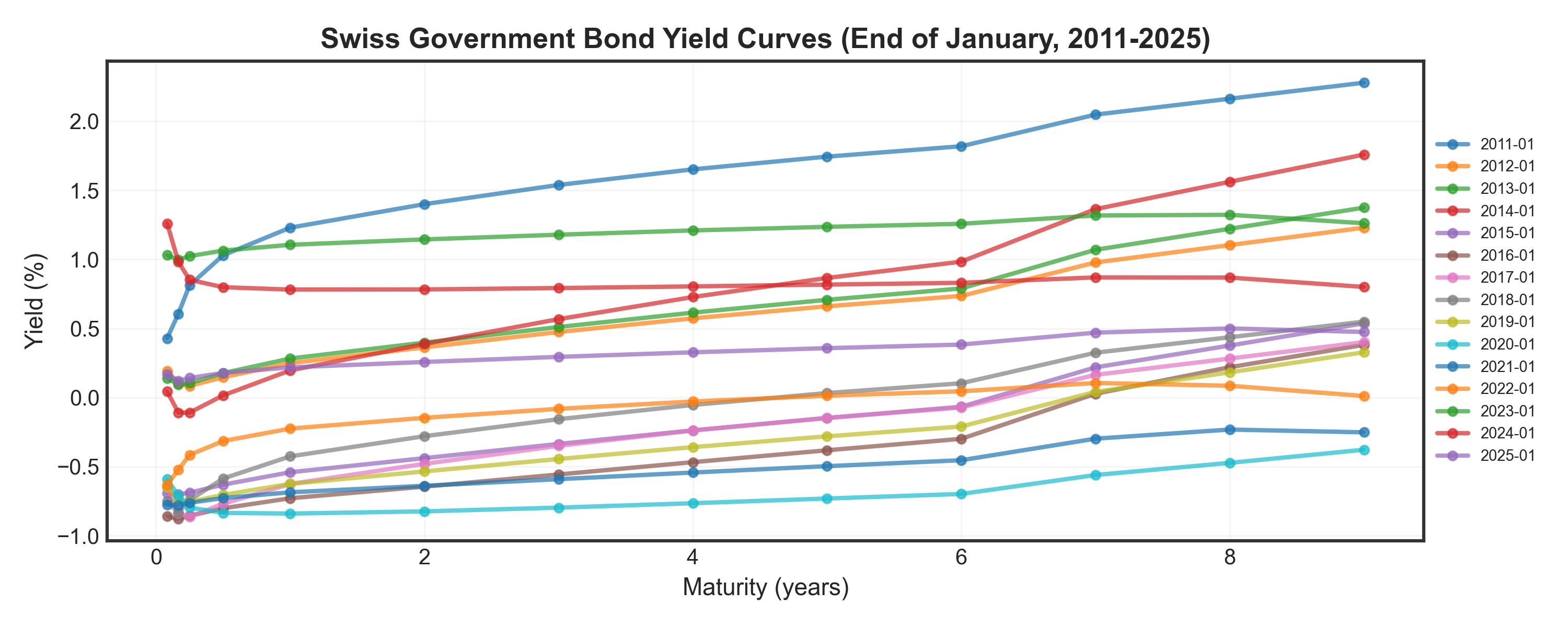
The Correlation Problem
Show code
fig, axes = plt.subplots(1, 2, figsize=(10, 4))

# Scatter plot: 1Y vs 2Y yields
_ = axes[0].scatter(df['1J'], df['2J'], alpha=0.5, s=30, color='steelblue', edgecolors='black', linewidth=0.5)
_ = axes[0].set_title("1-Year vs. 2-Year Yields", fontsize=11, fontweight='bold')
_ = axes[0].set_xlabel("1-Year Yield (%)", fontsize=10)
_ = axes[0].set_ylabel("2-Year Yield (%)", fontsize=10)
_ = axes[0].grid(True, alpha=0.3)

# Correlation heatmap
corr = df.iloc[:, 5:].corr()  # Use only yearly maturities for clarity
_ = sns.heatmap(corr, annot=True, fmt=".2f", cmap="RdYlGn", ax=axes[1],
            cbar_kws={'shrink': 0.8, 'pad': 0.02}, vmin=0.8, vmax=1,
            annot_kws={'size': 8})
_ = axes[1].set_title("Correlation Matrix (Yields)", fontsize=11, fontweight='bold')

plt.tight_layout(pad=2.0)
plt.show()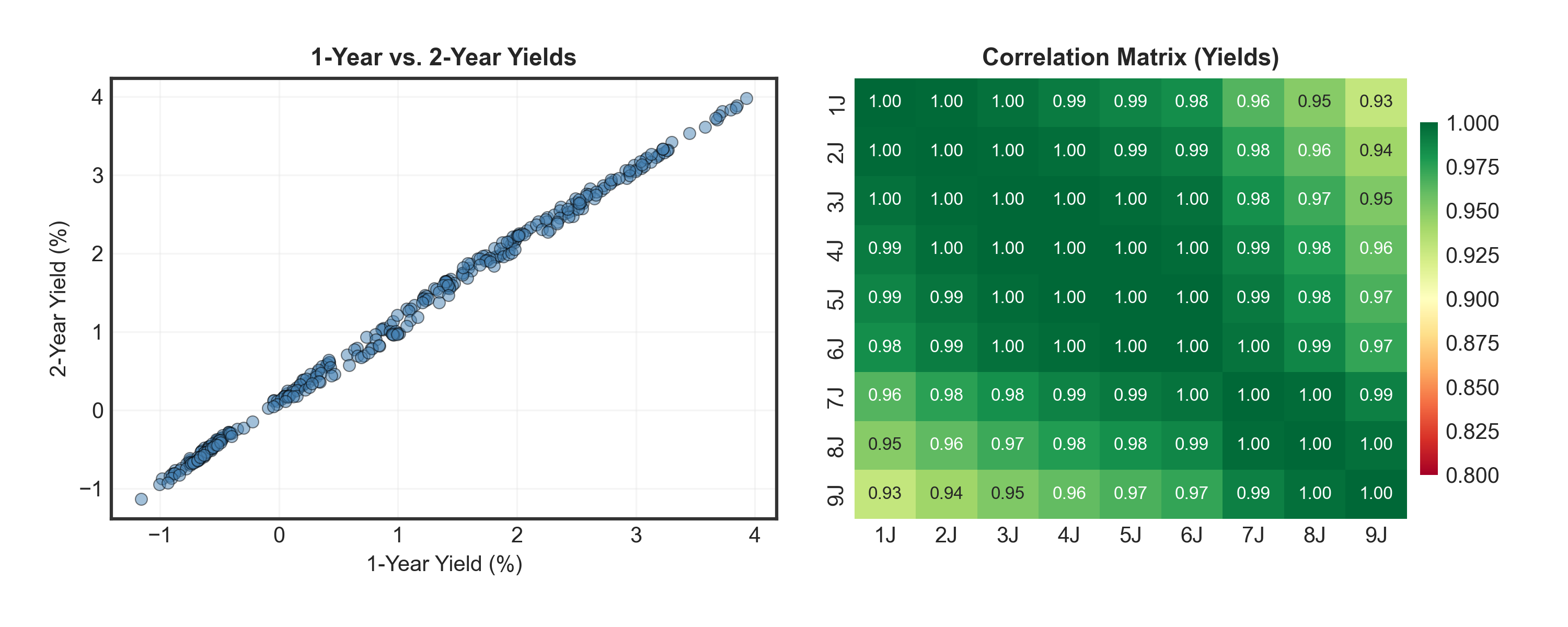
Warning
Problem: All yields are highly correlated (0.90-0.99)! We have redundant information across many maturities (1M, 2M, 3M, 6M, 1Y, 2Y, …, 9Y).
Solution: Use Principal Component Analysis (PCA) to find the key patterns and reduce to just a few key variables!
PCA: Steps
Step 1: Normalize Data
- Convert all variables to same scale (mean=0, std=1)
- Formula: \(z_{ij} = \frac{x_{ij} - \mu_j}{\sigma_j}\)
Step 2: Compute Principal Components
- Calculate covariance matrix: \(\mathbf{\Sigma} = \frac{1}{n-1}\mathbf{X}^T\mathbf{X}\)
- Find eigenvectors & eigenvalues: \(\mathbf{\Sigma} \mathbf{v}_k = \lambda_k \mathbf{v}_k\)
- \(\mathbf{v}_k\) are eigenvectors representing the directions of principal components (the “weights”)
- \(\lambda_k\) are eigenvalues, showing the variance explained by each component
- Sort by eigenvalues (largest = most variance explained)
Step 3: Interpret Components
- PC1 (largest \(\lambda_1\) ): Captures most variance → “Level”
- PC2 (second \(\lambda_2\) ): Next most variance → “Slope” etc.
Step 4: Transform & Reconstruct
- Project data: \(\mathbf{Z} = \mathbf{X} \cdot \mathbf{V}\) (PC scores)
- Reconstruct: \(\hat{\mathbf{X}} = \mathbf{Z}_K \cdot \mathbf{V}_K^T\) (using top K components)
Key Insights
- Total variance: First few components (K=2-3) typically capture 95-99% of total variance!
- Implementation: In practice, we can use
sklearn.decomposition.PCAfrom scikit-learn.
Why Normalize?
Variables with different scales would dominate PCA. Standardization ensures equal contribution, giving each variable mean = 0 and std = 1.
Finding Principal Components
Compute the covariance matrix, find its eigenvectors (PC directions) and eigenvalues (variance explained), then sort by importance.
Tip
Key insight: First 3 components explain >99% of variation! We can safely ignore the rest.
Understanding “Weights”
The weights (eigenvector values) tell us how much each maturity contributes when a principal component changes:
- Each yield curve = weighted combination of PC1 + PC2 + PC3
- Weights = the multipliers for each maturity when that component is “activated”
- Example: If PC1 = 2.0 and 1Y weight = 0.33, then PC1 contributes 2.0 × 0.33 = 0.66% to the 1Y yield
Show code
# Prepare data
df_yields = df.iloc[:, 5:]  # Use only yearly maturities
mean = df_yields.mean()
std = df_yields.std()
df_norm = (df_yields - mean) / std

# Compute PCA
cov_matrix = df_norm.cov()
eigen_values, eigen_vectors = np.linalg.eig(cov_matrix)
sorted_idx = np.argsort(eigen_values)[::-1]
eigen_vectors = eigen_vectors[:, sorted_idx]

# Get first 3 PCs - make maturities list dynamic based on actual data
maturities = list(range(1, len(df_yields.columns) + 1))
pc1 = eigen_vectors[:, 0]
pc2 = eigen_vectors[:, 1]
pc3 = eigen_vectors[:, 2]

# Print actual weights for PC1 to show they're approximately equal
print("PC1 weights (1Y-9Y):", np.round(pc1, 3))
print("Theoretical equal weight for 9 variables:", np.round(1/np.sqrt(9), 3))
print("\nVerification - Each PC is normalized to length 1:")
print(f"PC1 norm: {np.linalg.norm(pc1):.6f}")
print(f"PC2 norm: {np.linalg.norm(pc2):.6f}")
print(f"PC3 norm: {np.linalg.norm(pc3):.6f}")
print("\nCross-PC sum for 1Y maturity (NOT constrained to 1):")
print(f"PC1[1Y] + PC2[1Y] + PC3[1Y] = {pc1[0]:.3f} + {pc2[0]:.3f} + {pc3[0]:.3f} = {pc1[0] + pc2[0] + pc3[0]:.3f}")

# Example reconstruction for first observation
print("\nExample: Reconstructing 1Y yield for first date:")
pc_scores = df_norm.dot(eigen_vectors)
first_date_1y_norm = pc_scores.iloc[0, 0] * pc1[0] + pc_scores.iloc[0, 1] * pc2[0] + pc_scores.iloc[0, 2] * pc3[0]
first_date_1y_actual = df_norm.iloc[0, 0]
print(f"  PC1_score × PC1_weight[1Y] + PC2_score × PC2_weight[1Y] + PC3_score × PC3_weight[1Y]")
print(f"  = {pc_scores.iloc[0, 0]:.3f} × {pc1[0]:.3f} + {pc_scores.iloc[0, 1]:.3f} × {pc2[0]:.3f} + {pc_scores.iloc[0, 2]:.3f} × {pc3[0]:.3f}")
print(f"  = {first_date_1y_norm:.3f}")
print(f"  Actual normalized 1Y yield: {first_date_1y_actual:.3f}")
print(f"  Match: {np.isclose(first_date_1y_norm, first_date_1y_actual)}")

# Plot
fig, axes = plt.subplots(1, 3, figsize=(10, 3), sharey=True)

_ = axes[0].plot(maturities, pc1, marker='o', linewidth=2.5, markersize=8, color='#0173B2')
_ = axes[0].axhline(y=0, color='black', linestyle='--', linewidth=1)
_ = axes[0].set_title("PC1: Level Shift", fontsize=11, fontweight='bold')
_ = axes[0].set_xlabel("Maturity (years)", fontsize=10)
_ = axes[0].set_ylabel("Weight", fontsize=10)
_ = axes[0].grid(True, alpha=0.3)
_ = axes[0].text(5, max(pc1)*1.25, "Almost constant\n→ shifts curve up/down",
             ha='center', fontsize=9, bbox=dict(boxstyle='round', facecolor='wheat', alpha=0.5))

_ = axes[1].plot(maturities, pc2, marker='o', linewidth=2.5, markersize=8, color='#E69F00')
_ = axes[1].axhline(y=0, color='black', linestyle='--', linewidth=1)
_ = axes[1].set_title("PC2: Slope/Tilt", fontsize=11, fontweight='bold')
_ = axes[1].set_xlabel("Maturity (years)", fontsize=10)
_ = axes[1].grid(True, alpha=0.3)
_ = axes[1].text(5, max(pc2)*0.95, "Linear trend\n→ tilts curve",
             ha='center', fontsize=9, bbox=dict(boxstyle='round', facecolor='wheat', alpha=0.5))

_ = axes[2].plot(maturities, pc3, marker='o', linewidth=2.5, markersize=8, color='#CC79A7')
_ = axes[2].axhline(y=0, color='black', linestyle='--', linewidth=1)
_ = axes[2].set_title("PC3: Curvature", fontsize=11, fontweight='bold')
_ = axes[2].set_xlabel("Maturity (years)", fontsize=10)
_ = axes[2].grid(True, alpha=0.3)
_ = axes[2].text(5, max(pc3)*0.78, "U-shape\n→ bends curve",
             ha='center', fontsize=9, bbox=dict(boxstyle='round', facecolor='wheat', alpha=0.5))

plt.tight_layout()
plt.show()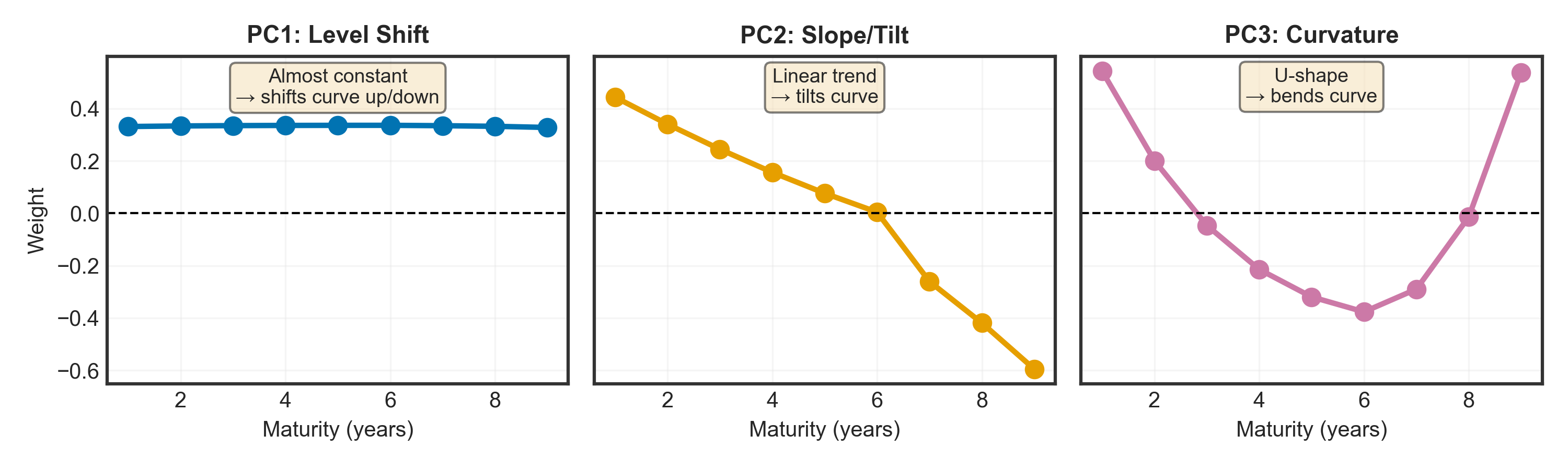
What Do These Components Actually Mean?
PC1: Level Shift (~98.44% of variance)
- Weights: All maturities ≈ 0.33 (almost equal and positive)
- Interpretation: All yields move together by the same amount
- When PC1 score increases by 1 → ALL rates shift up by ~0.33% in parallel
- Real example: Central bank raises policy rate → entire curve moves up together (inflation shock)
PC2: Slope/Tilt (~1.46% of variance)
- Weights: Short-term: positive (+0.4) | Long-term: negative (-0.6)
- Interpretation: Short and long rates move in opposite directions
- When PC2 score increases → short rates ↑ & long rates ↓ → curve flattens
- Real example: Recession fears → long rates drop (expect rate cuts), short rates stay high
PC3: Curvature (~0.09% of variance)
- Weights: Ends: positive | Middle (4-6Y): negative
- Interpretation: Middle maturities move opposite to short/long ends
- When PC3 score increases → middle bends down, ends bend up → humped curve
- Real example: Expect rates to rise then fall → medium-term rates peak
In simple terms: PC1 score = “How high is the curve?”, PC2 score = “How steep?”, PC3 score = “How curved?”
Transform & Reconstruct
Project the normalized data onto principal components, then reconstruct using only the top K components.
Show code
# Transform data to PC space
PC_scores = df_norm.dot(eigen_vectors)

# Select some random bond dates to track consistently
np.random.seed(1)
sample_indices = np.random.choice(len(df_norm), size=8, replace=False)
sample_indices = sorted(sample_indices)

# Use only the 9 yearly maturities that match our PCA dimensions
maturities = list(range(1, 10))  # 1Y through 9Y to match the 9 columns we used for PCA

# Create 3 panels: 1 Component, 2 Components, Original
fig, axes = plt.subplots(1, 3, figsize=(14, 4.5), sharey=True)

colors = plt.cm.tab10(np.linspace(0, 1, len(sample_indices)))

# Store all data for consistent y-axis scaling
all_data = []

# Panel 1: Reconstruction with 1 component
reconstructed_1 = PC_scores.iloc[:, :1].dot(eigen_vectors[:, :1].T)
reconstructed_1_denorm = reconstructed_1 * std.values + mean.values
all_data.extend(reconstructed_1_denorm.values.flatten())

for idx, sample_idx in enumerate(sample_indices):
    date_label = df['date'].iloc[sample_idx]
    axes[0].plot(maturities, reconstructed_1_denorm.iloc[sample_idx],
                alpha=0.7, linewidth=2, color=colors[idx], label=date_label)

axes[0].set_title("Using 1 Component", fontsize=11, fontweight='bold')
axes[0].set_xlabel("Maturity (years)", fontsize=10)
axes[0].set_ylabel("Yield (%)", fontsize=10)
axes[0].grid(True, alpha=0.3)

# Panel 2: Reconstruction with 2 components
reconstructed_2 = PC_scores.iloc[:, :2].dot(eigen_vectors[:, :2].T)
reconstructed_2_denorm = reconstructed_2 * std.values + mean.values
all_data.extend(reconstructed_2_denorm.values.flatten())

for idx, sample_idx in enumerate(sample_indices):
    axes[1].plot(maturities, reconstructed_2_denorm.iloc[sample_idx],
                alpha=0.7, linewidth=2, color=colors[idx])

axes[1].set_title("Using 2 Components", fontsize=11, fontweight='bold')
axes[1].set_xlabel("Maturity (years)", fontsize=10)
axes[1].grid(True, alpha=0.3)

# Panel 3: Original data
for idx, sample_idx in enumerate(sample_indices):
    original = df_yields.iloc[sample_idx].values
    all_data.extend(original)
    axes[2].plot(maturities, original,
                alpha=0.7, linewidth=2, color=colors[idx])

axes[2].set_title("Original Data", fontsize=11, fontweight='bold')
axes[2].set_xlabel("Maturity (years)", fontsize=10)
axes[2].grid(True, alpha=0.3)

# Set consistent y-axis limits across all panels
y_min, y_max = min(all_data), max(all_data)
y_margin = (y_max - y_min) * 0.05
for ax in axes:
    ax.set_ylim(y_min - y_margin, y_max + y_margin)

# Add overall title
fig.suptitle('Yield Curve Reconstruction Quality', fontsize=14, fontweight='bold', y=0.98)

# Add legend to the first panel only with 2 rows (horizontal layout)
axes[0].legend(title='Sample Dates', fontsize=7, loc='upper left', framealpha=0.9, ncol=4)

plt.tight_layout()
plt.show()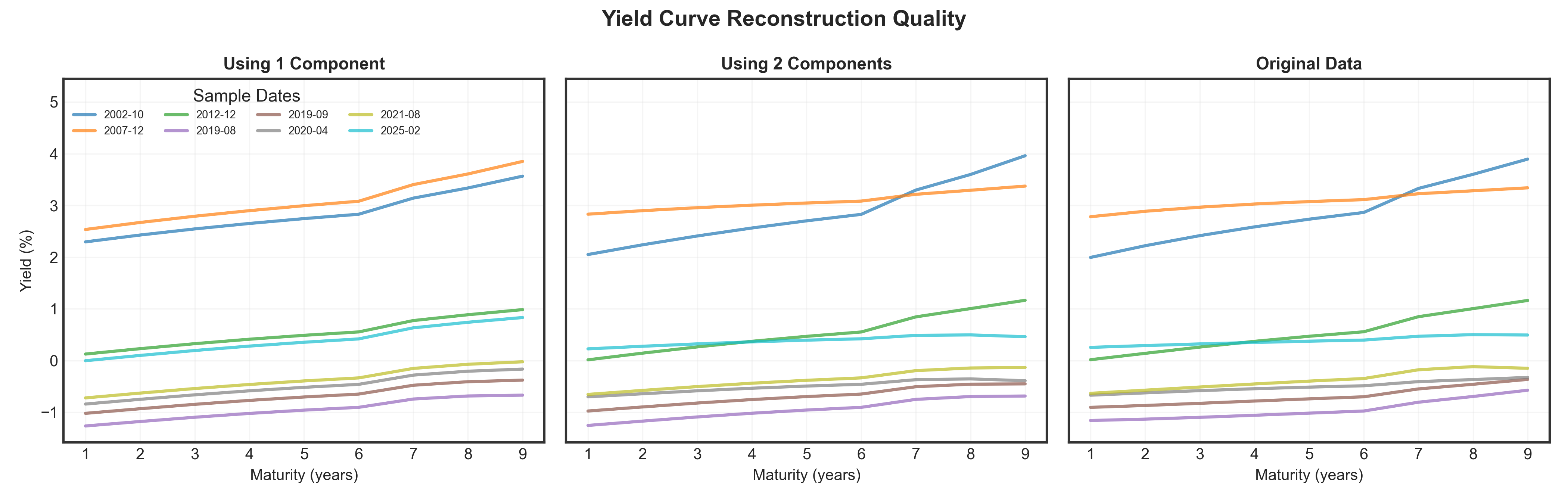
Result
Just 3 numbers (PC1, PC2, PC3 scores) capture nearly all information in 13 yields! Notice how 1 component is too simple (flat), 2 components add slope, and 3 components capture full curve shapes.
Case Study II: PCA Summary
Key Results
Dimensionality Reduction
- 9 correlated yields (13 in total) → 3 uncorrelated components
- 99.9% of variance retained
- Minimal information loss
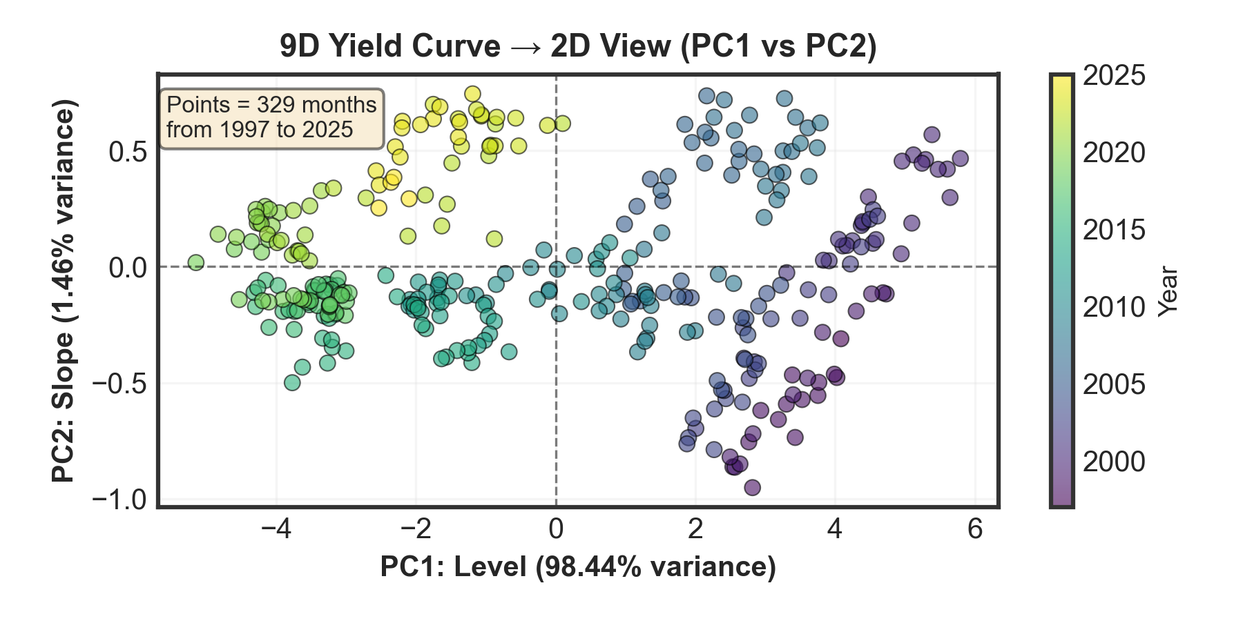
Three Components & 2D Plot Interpretation:
PC1 (Level): 98.44% variance — Parallel shift of entire curve
Horizontal axis: Movement left/right = interest rates rising/falling overallPC2 (Slope): 1.46% variance — Curve steepening/flattening
Vertical axis: Movement up/down = yield curve steepening/flatteningPC3 (Curvature): 0.09% variance — Mid-curve bending
Practical Value
When to use PCA:
- Many correlated variables
- Need dimensionality reduction
- Want to remove noise
- Linear relationships in data
Real applications:
- Interest rate modeling
- Portfolio risk analysis
- Customer segmentation
- Image compression
Important limitations:
- Only captures linear patterns
- Requires standardization
- Components are abstract
- Sensitive to outliers