Statistical focus: Built-in functions for distributions, relationships
DataFrame integration: Works seamlessly with Pandas
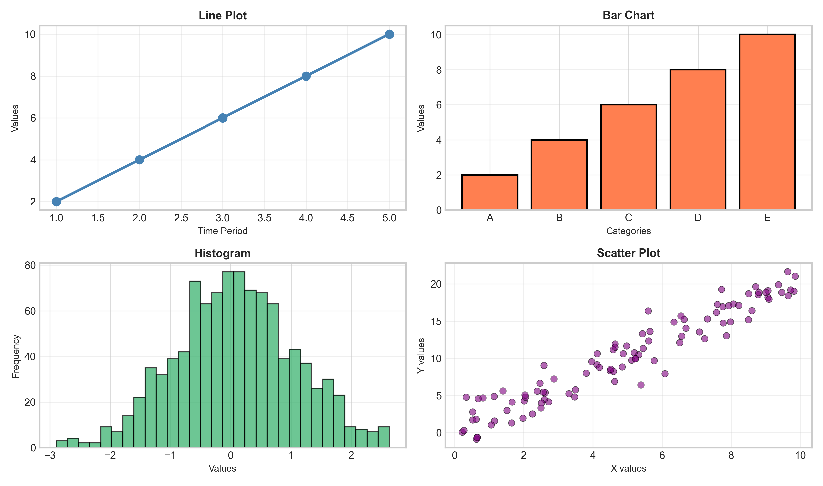
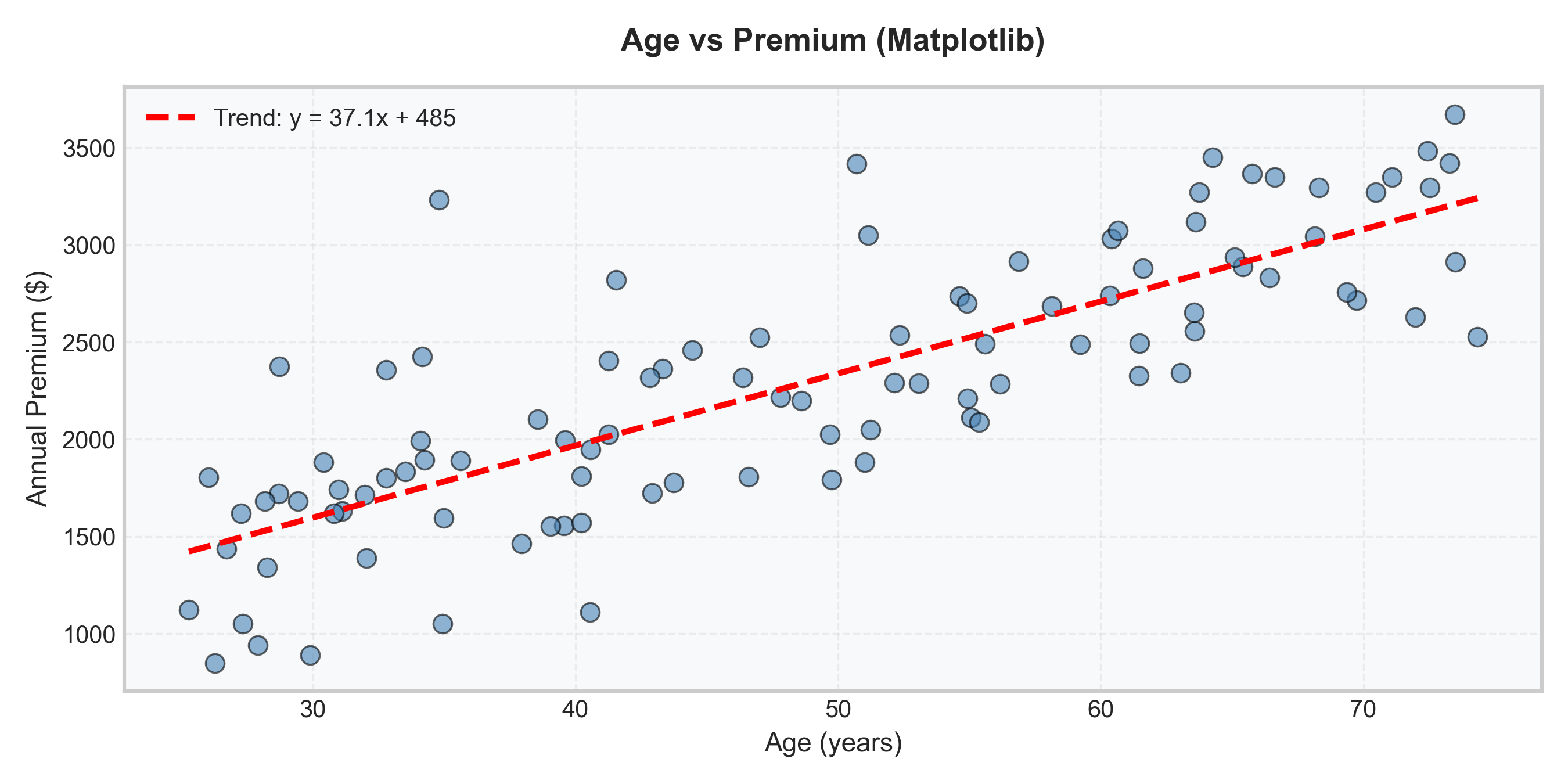
Matplotlib (more code):
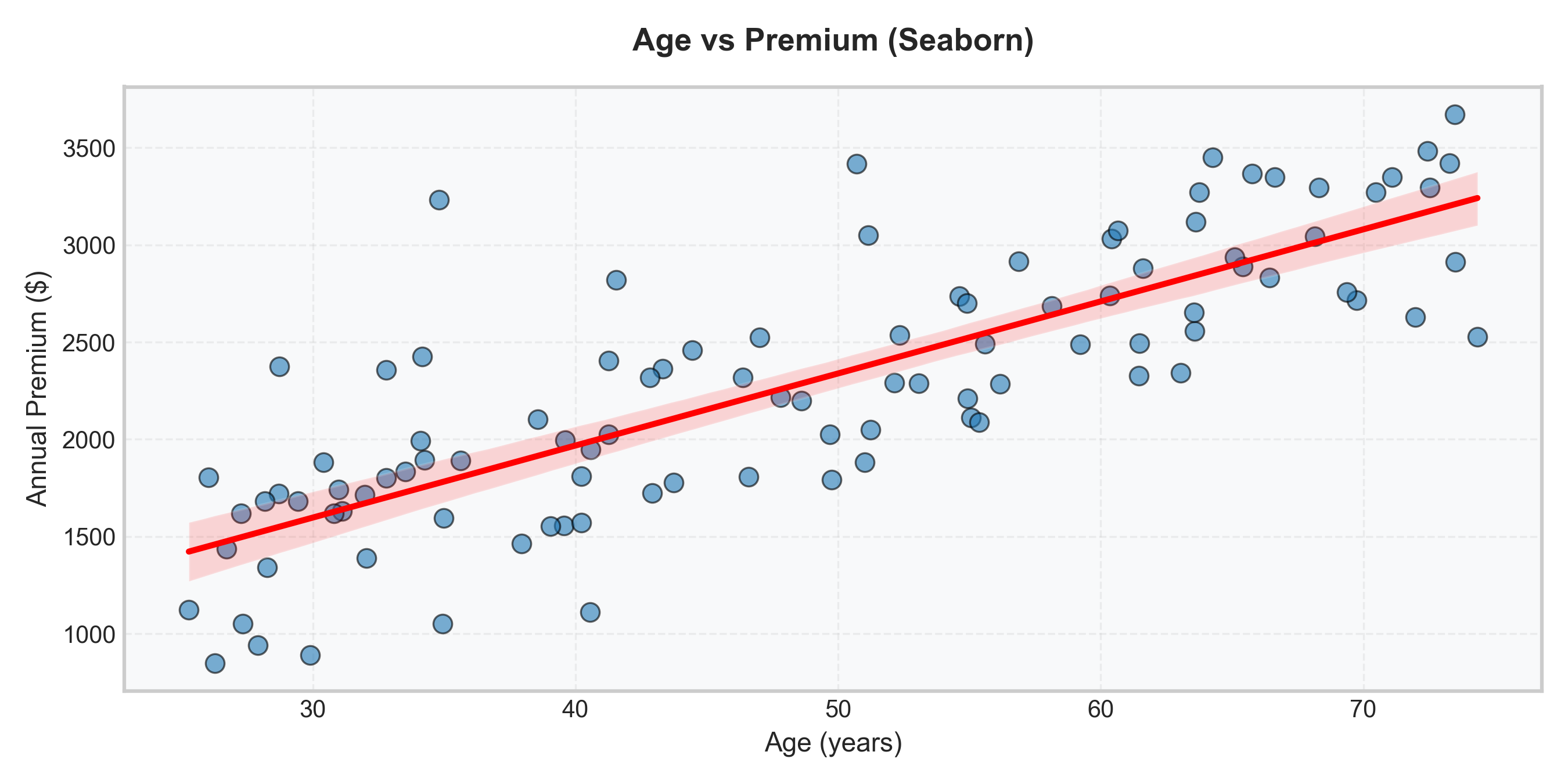
Seaborn (cleaner):
Tip
Result: Seaborn adds KDE, better styling, with less code!
Seaborn Automatically Adds Statistical Overlays:
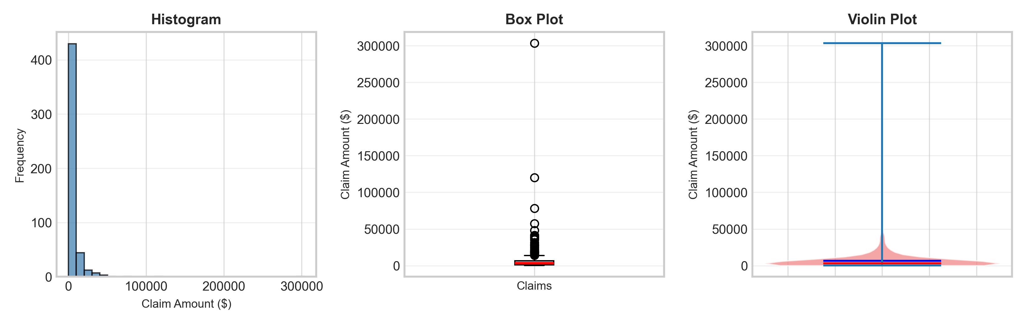
histplot() with kde=True → Adds smooth density curve
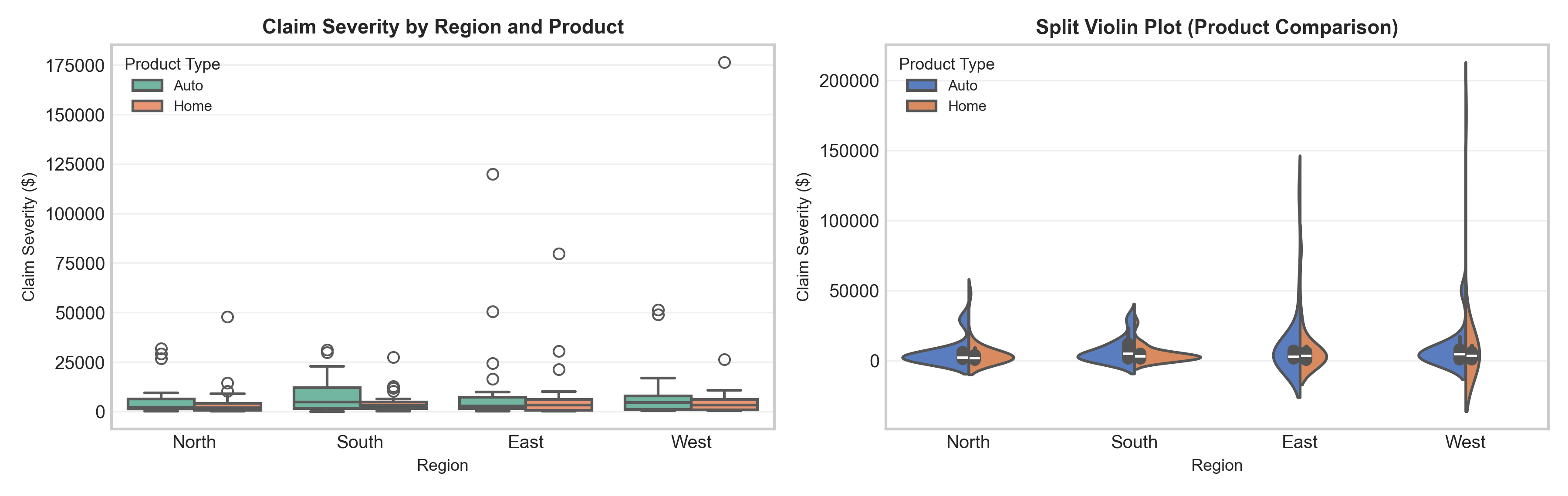
boxplot() → Automatic grouping by categories with x= parameter
violinplot() → Combines density + quartiles in one plot
Show code
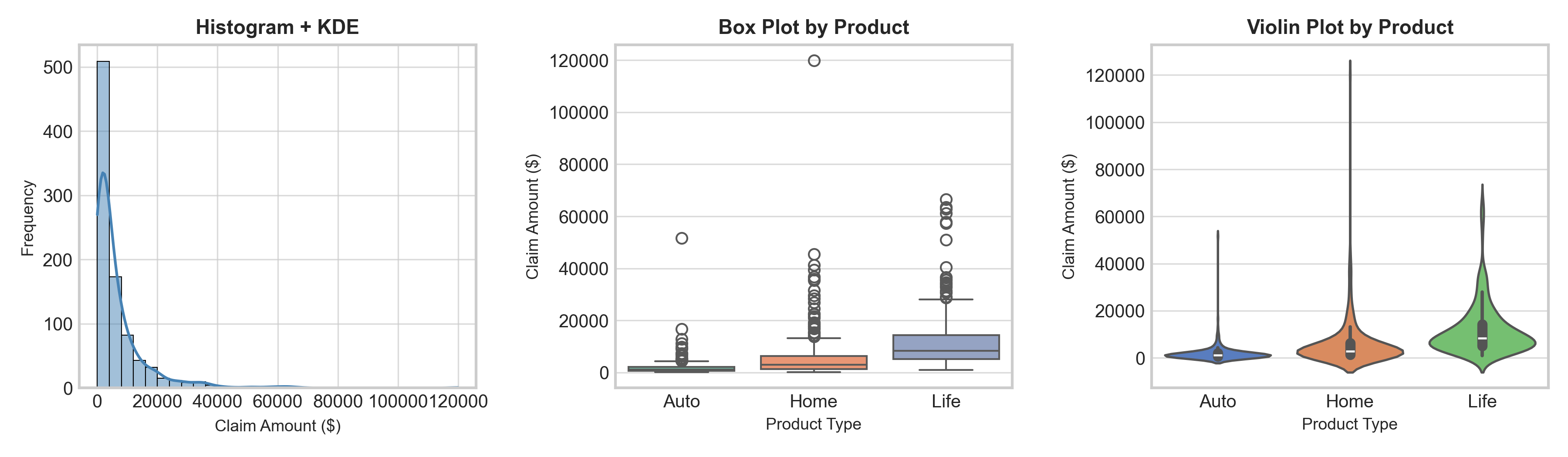
import pandas as pdimport seaborn as sns# Simulate claim severity data for different product typesnp.random.seed(42)n =300data = pd.DataFrame({'Product': np.repeat(['Auto', 'Home', 'Life'], n),'Claim_Amount': np.concatenate([ np.random.lognormal(7, 1, n), # Auto np.random.lognormal(8, 1.2, n), # Home np.random.lognormal(9, 0.8, n) # Life ])})# Set seaborn stylesns.set_style("whitegrid")fig, axes = plt.subplots(1, 3, figsize=(12, 3.5))# Histogram with KDEsns.histplot(data=data, x='Claim_Amount', kde=True, ax=axes[0], bins=30, color='steelblue', edgecolor='black', linewidth=0.5)axes[0].set_title("Histogram + KDE", fontsize=11, fontweight='bold')axes[0].set_xlabel("Claim Amount ($)", fontsize=9)axes[0].set_ylabel("Frequency", fontsize=9)# Box plot by categorysns.boxplot(data=data, x='Product', y='Claim_Amount', ax=axes[1], palette='Set2')axes[1].set_title("Box Plot by Product", fontsize=11, fontweight='bold')axes[1].set_ylabel("Claim Amount ($)", fontsize=9)axes[1].set_xlabel("Product Type", fontsize=9)# Violin plot by categorysns.violinplot(data=data, x='Product', y='Claim_Amount', ax=axes[2], palette='muted')axes[2].set_title("Violin Plot by Product", fontsize=11, fontweight='bold')axes[2].set_ylabel("Claim Amount ($)", fontsize=9)axes[2].set_xlabel("Product Type", fontsize=9)plt.tight_layout()plt.show()
Actuarial insight
Life insurance claims show higher median but lower variance than Auto/Home → reflects predictable payouts for death benefits vs. variable property/accident damages.
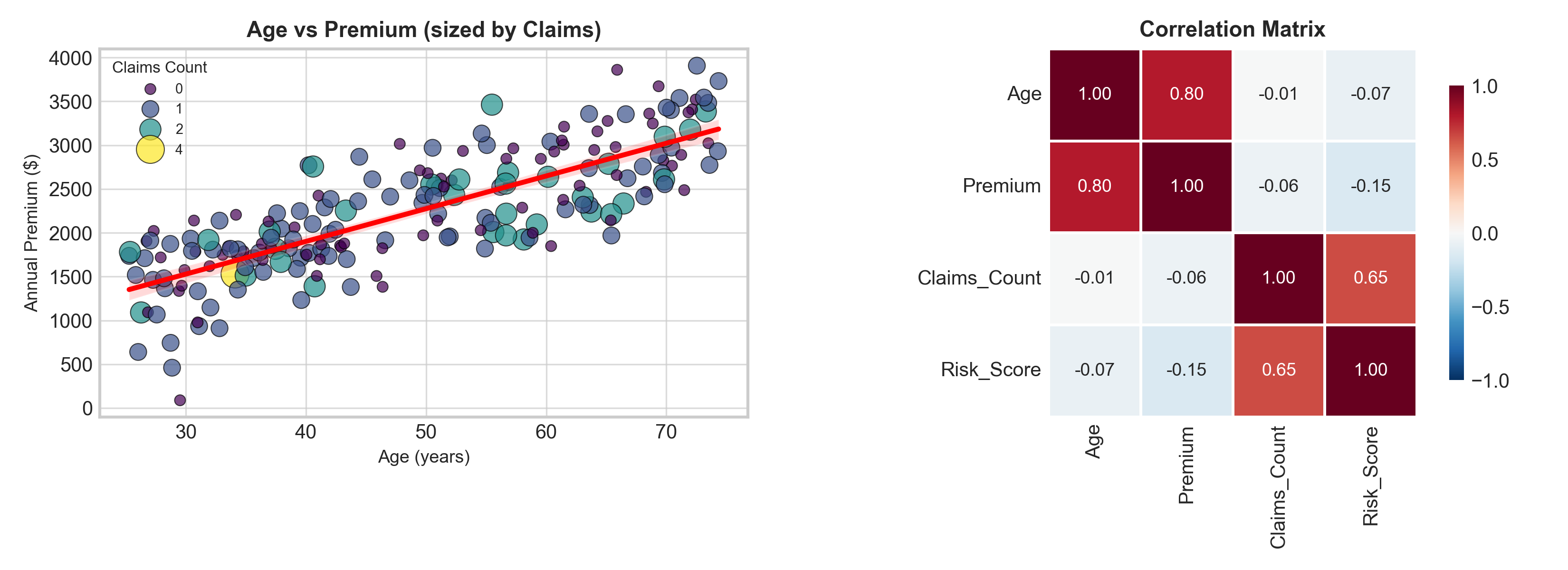
Seaborn for Relationships: Example Plots
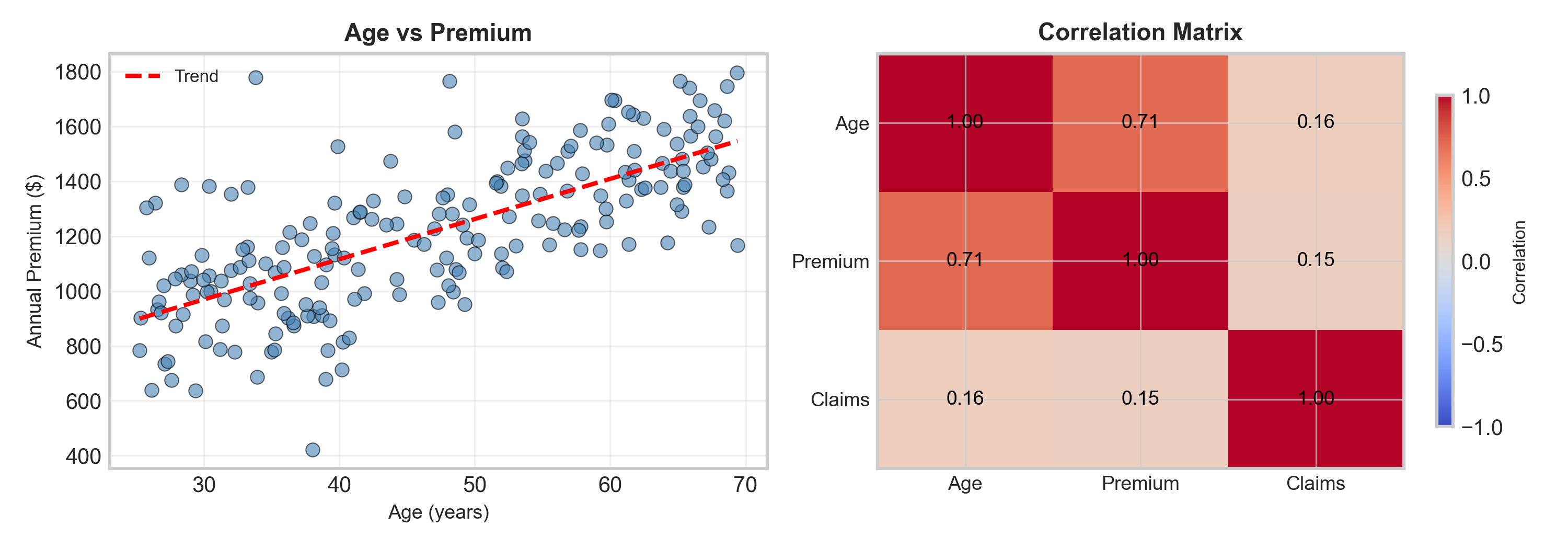
scatterplot() → Supports hue= and size= for 3rd/4th dimensions
regplot() → Adds regression line + confidence interval automatically
heatmap() → Visualize correlation matrices with annotations
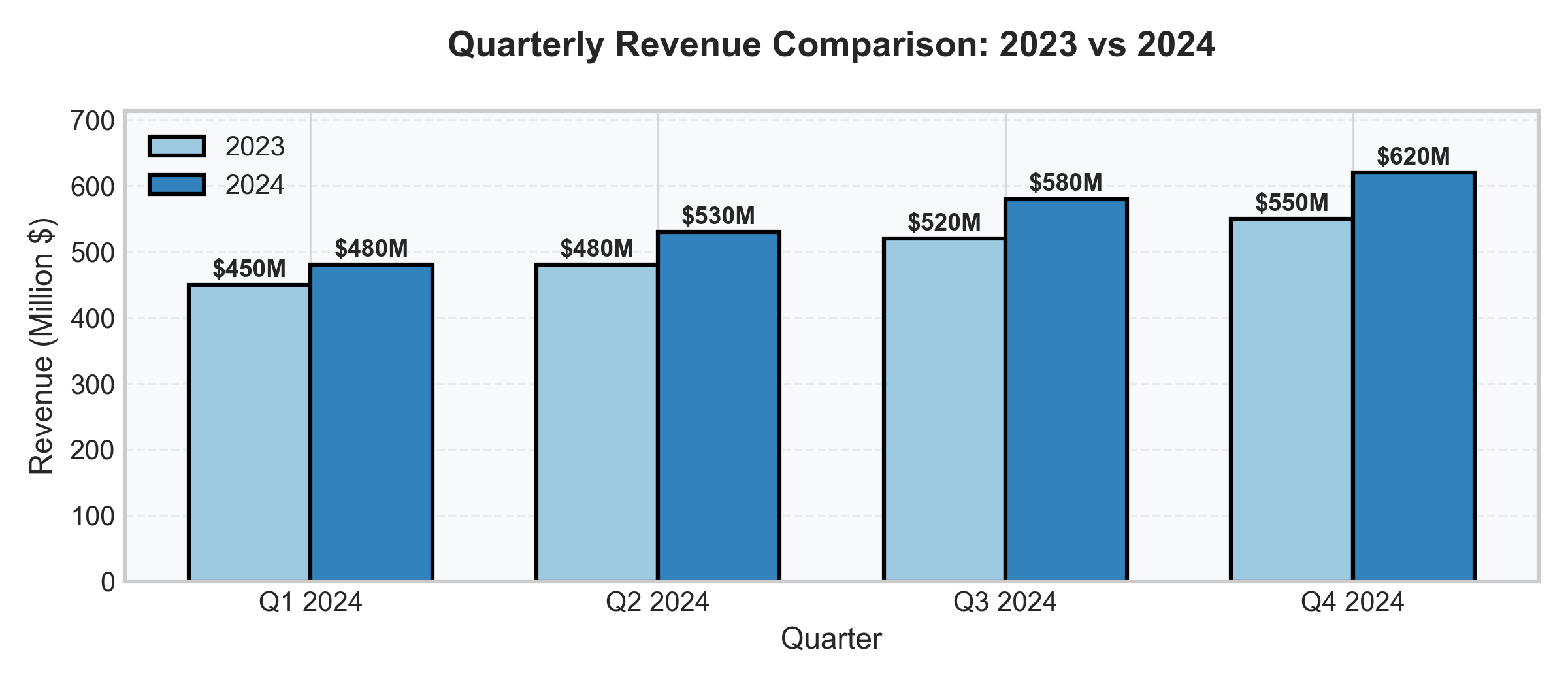
Y-axis starts at 0 → Honest representation (critical for bar charts!)
Value labels → No guessing, exact numbers visible
Legend → Explains grouping
Grid → Aids accurate reading
Professional appearance → Clean, polished, credible
The 5-second test: Can someone understand the main message in 5 seconds? ✅
10 Visualization Rules
Always label axes and title → Context is king
Start y-axis at zero (for bar charts) → Avoid misleading scales
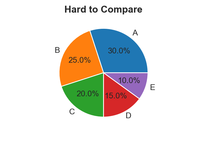
Choose appropriate plot type → Match plot to data type
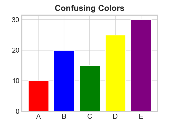
Use color purposefully → 2-3 colors max, meaningful encoding
Add legends when needed → Explain what viewers see
Keep it simple → Remove chart junk, focus on message
Consider your audience → Adjust complexity accordingly
Use consistent scales → When comparing plots
Highlight key insights → Guide viewer attention
Test readability → Can someone understand it in 5 seconds?
🤔 Pop Quiz
Your colleague’s plot shows impressive trends with perfect colors and styling. But management keeps asking “What is this plot representing?” What’s the most likely problem?
Switch from Matplotlib to Seaborn for better defaults
Add descriptive axis labels, title, and units
Increase the figure size from 8x6 to 12x8 inches
Change the color scheme to match company branding
Key Takeaways
Essential concepts covered today:
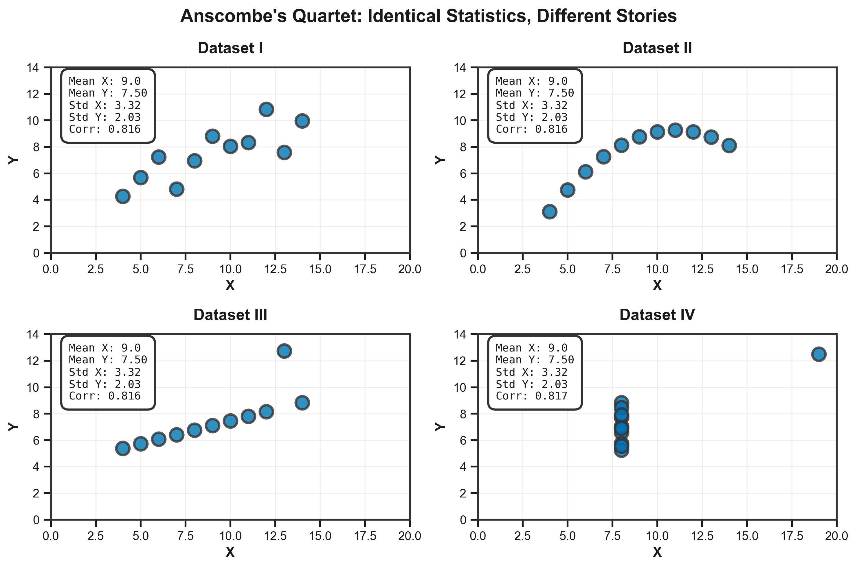
Why Visualize? To tell a story and understand trends (identical statistics ≠ identical patterns)