4 Modeling the spread of COVID-19 worldwide
In this section, we fit the logistic model to every country in the covid19_data_filtered dataset.
4.1 Fitting the logistic model to every country
Here we make use of the nested data, list-columns and logistic_model to fit the logistic model to every country in the dataset.
Because, for some countries, the optimization method might not converge, we will use the possibly() function to see which ones fail and which ones succeed.
Now one may wonder, for which country does the optimization fail ?
First, let’s fit the logistic model to every country and have a look at which one are not converging.
The countries for which the optimization fails are the following:
Denmark, Japan, Pakistan
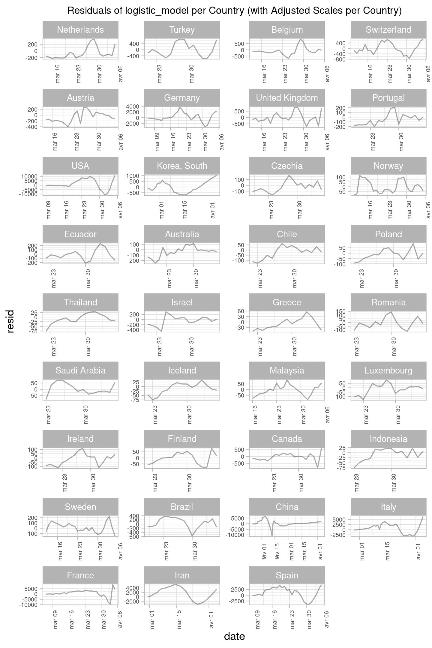
We will also assess the goodness-of-fit of the logistic model in the various countries. Lets plot the residuals per country to have a look at the general trend of the residual in the model.

Let’s plot the residual per country to have a better look, and then we will zoom on the countries with the highest values of the residuals (meaning that they are the ones for which the model has a lower accuracy in the predictions).
 Note: The axis are for this graph
 Residual of logistic_model per country and the one below has been adjusted for each country in order to be able to see better the different distributions.

We would like to also have also a score which shows the goodness-of-fit of the model for each country, however according to the (Burnham and Anderson 2002, 80), it is mentioned that AIC cannot be used for models with different number of observations (and also different datasets) as we see in the table below.
| country | observations |
|---|---|
| Australia | 19 |
| Austria | 23 |
| Belgium | 24 |
| Brazil | 18 |
| Canada | 19 |
| Chile | 15 |
| China | 75 |
| Czechia | 18 |
| Ecuador | 15 |
| Finland | 15 |
| France | 31 |
| Germany | 31 |
| Greece | 15 |
| Iceland | 15 |
| Indonesia | 14 |
| Iran | 37 |
| Ireland | 18 |
| Israel | 16 |
| Italy | 39 |
| Korea, South | 43 |
| Luxembourg | 16 |
| Malaysia | 21 |
| Netherlands | 24 |
| Norway | 26 |
| Poland | 15 |
| Portugal | 18 |
| Romania | 14 |
| Saudi Arabia | 14 |
| Spain | 29 |
| Sweden | 25 |
| Switzerland | 26 |
| Thailand | 15 |
| Turkey | 16 |
| USA | 28 |
| United Kingdom | 24 |
4.2 Fitted parameters and long-term predictions
We then describe the fitted parameters (i.e., the final size and the infection rates), both on a per-country basis and some aggregate numbers (e.g., total size of the epidemic over all considered countries). Furthermore, we study the evolution (say for \(t\) from 0 to 50) of the predictions of the number of confirmed cases from our models. Similarly as was discussed in the last sub-section of the exploratory data analysis, the number of confirmed cases per 100,000 habitants is also important to understand how specific countries are managing the spread of the epidemic. Thus, we predict the evolution of this number (i.e., by dividing our predictions for confirmed cases by the population size) and discuss.
We will do the aforementioned using the following functions:
- Format the fitted parameters using
broom::tidy(). - For the long-term predictions, we use
data = data.frame(t = 0:50)inadd_predictions().
| country | K | R |
|---|---|---|
| Australia | 6490 | 0.229 |
| Austria | 13475 | 0.227 |
| Belgium | 30106 | 0.192 |
| Brazil | 24528 | 0.194 |
| Canada | 26125 | 0.209 |
| Chile | 8226 | 0.178 |
| China | 80822 | 0.263 |
| Czechia | 7156 | 0.159 |
| Ecuador | 10116 | 0.131 |
| Finland | 4143 | 0.105 |
| France | 159261 | 0.185 |
| Germany | 114953 | 0.222 |
| Greece | 4636 | 0.093 |
| Iceland | 3258 | 0.094 |
| Indonesia | 4284 | 0.141 |
| Iran | 63936 | 0.175 |
| Ireland | 8411 | 0.167 |
| Israel | 10943 | 0.242 |
| Italy | 131962 | 0.201 |
| Korea, South | 9220 | 0.265 |
| Luxembourg | 3488 | 0.179 |
| Malaysia | 4802 | 0.148 |
| Netherlands | 24000 | 0.184 |
| Norway | 7300 | 0.143 |
| Poland | 16456 | 0.141 |
| Portugal | 15335 | 0.219 |
| Romania | 7725 | 0.180 |
| Saudi Arabia | 3811 | 0.159 |
| Spain | 141690 | 0.259 |
| Sweden | 26528 | 0.109 |
| Switzerland | 22253 | 0.227 |
| Thailand | 3162 | 0.151 |
| Turkey | 36048 | 0.311 |
| United Kingdom | 90683 | 0.201 |
| USA | 417895 | 0.280 |
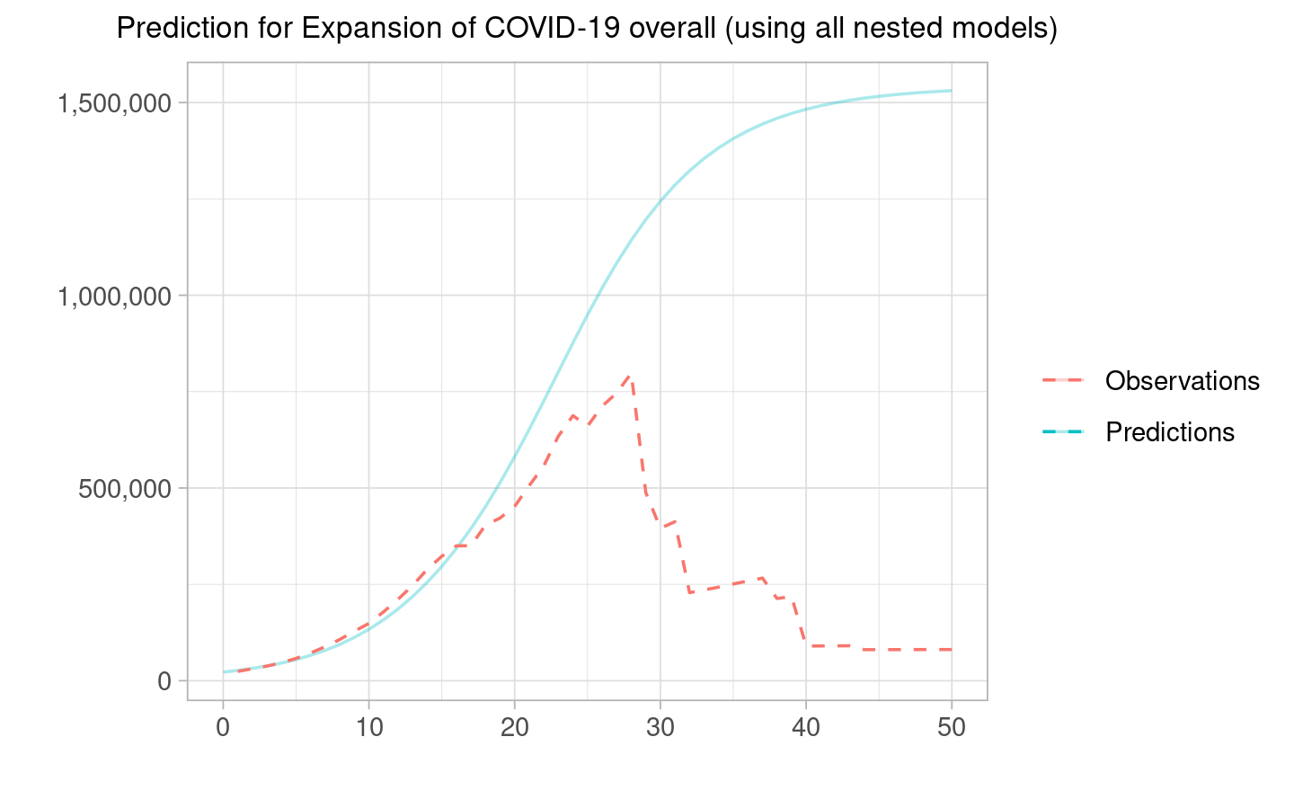
Now let’s look at the prediction per country.
 Comment: We can see that the countries with the highest absolute values are the US, Spain, Germany, France and Italy (over a 100’000 of final confirmed cases predicted). This is in line with what we have found in the EDA part of our analysis.
In order to look at the aggregated sum, we can either use the logistic model on the filtered data and calculate new coefficients as we did with the swiss model but now applied to all countries and the second approach is to do it by region to use the fitted parameters of each country (nested) which makes more sense.
We can also do the aggregated sum for all countries only for the first 50 periods (because afterwards we do not have observed data points for almost all countries hence the observations naturally goes down). This model is a better one because it takes into account all the different coefficients rather than assigning the same one to all the countries.
Note: In the graph below, Please feel free to scroll over the country to see which one is contributing the most.
Comment: In terms of regions, we see the highest increase for North America due to the predicted increase for the US, followed by Europe & Central Asia, Italy, Spain and France among many and lastly, East Asian & Pacific with the most predicted cases for China.Furthermore, referring back to the per-country predictions, we can also calculate the same for cases per 100,000 habitants displayed by the interactive plot below.
Comment: We can see that Iceland (green line) and Luxembourg (blue line) will have the highest number of confirmed cases per 100,000 habitants which is same as what we saw previously in the section of exploratory data analysis. This is due to their small populations and their infection numbers will be far larger than the countries that follow like Spain, Switzerland Belgium.